
Thursday, May 22, 2014
Friday, May 16, 2014

Wednesday, May 14, 2014
Vocab review 3
Rhythm-When the regular repetition of particular forms or elements occurs in a work of art, that work is said to have rhythm. It suggests motion.


Directional Movement- The flow in the piece
Proportion/Scale-Proportion refers to the relationship of parts of a body to one another and to the body as a whole, whereas scale is the relationship of parts of an image to the image as a whole.
Balance-the ways in which the elements (lines, shapes, colors, textures, etc.) of a piece are arranged.
Unity-all of the elements of a piece combine to make a balanced, harmonious, complete whole.
Harmony- pulls the pieces of a visual image together.
Contrast-the arrangement of opposite elements (light vs. dark colors, rough vs. smooth textures, large vs. small shapes, etc.) in a piece so as to create visual interest, excitement and drama
Emphasis(Focal Point/ Center of Interest

Monday, May 12, 2014

Tuesday, May 6, 2014
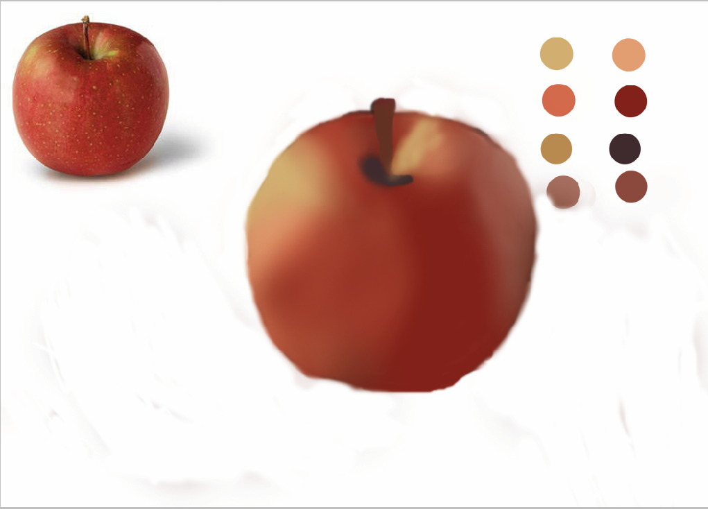
Apple painting

Wednesday, April 30, 2014
Monday, April 28, 2014

Tuesday, April 22, 2014
Wallpaper 8

Wallpaper 7

Monday, April 14, 2014

Thursday, April 10, 2014
Vocab review 1
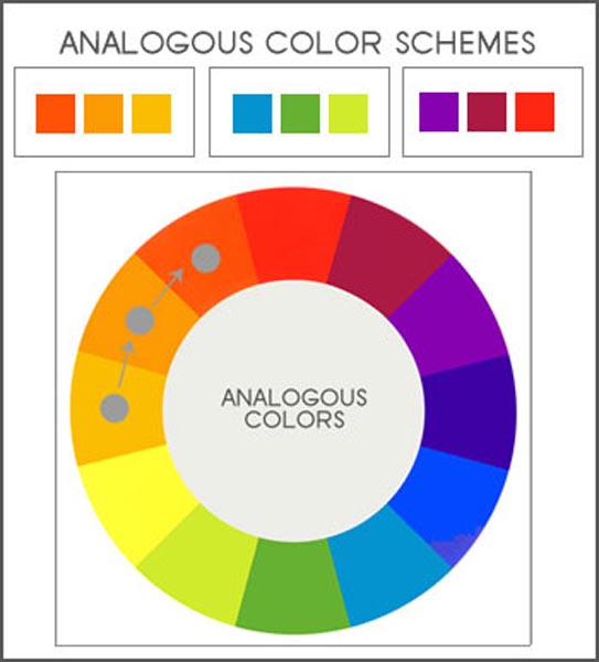
Analogous Colors- groups of colors that are adjacent to each other on the color wheel, with one being the dominant color, which tends to be a primary or secondary color, and two on either side complementing,which tend to be tertiary.

Complimentary Colors-The colors that are positioned opposite one another

Primary Colors- Primary colors are those that cannot be made from mixing other colors. Instead, primary colors are the source of other colors. The primary colors are red, blue, and yellow

Secondary Colors-Secondary colors are made by mixing equal parts of primary colors.

Tertiary Colors- Tertiary colors are formed by mixing two secondary colors

Asymmetry- lack of equality or equivalence between parts or aspects of something; lack of symmetry.

Symmetry- the quality of something that has two sides or halves that are the same or very close in size, shape, and position : the quality of having symmetrical parts.
Complimentary Colors-The colors that are positioned opposite one another
Primary Colors- Primary colors are those that cannot be made from mixing other colors. Instead, primary colors are the source of other colors. The primary colors are red, blue, and yellow
Secondary Colors-Secondary colors are made by mixing equal parts of primary colors.
Tertiary Colors- Tertiary colors are formed by mixing two secondary colors
Asymmetry- lack of equality or equivalence between parts or aspects of something; lack of symmetry.
Symmetry- the quality of something that has two sides or halves that are the same or very close in size, shape, and position : the quality of having symmetrical parts.
Wednesday, March 26, 2014
Wallpaper 6
This is my 6th wallpaper. It's a colorful tornado. But it kind of looks like a color wheel.

Wallpaper 5
This is my 5th wallpaper. It provides and abstract colored background. I though it was really cool because of the colored bars.

Vocab review 2
Line- A mark or stroke that spans a distance between two points.
Shape- The space used of areas in two-dimensional that can be defined by edges, setting one flat specific place apart from another.


Shape- The space used of areas in two-dimensional that can be defined by edges, setting one flat specific place apart from another.

Form/Volume- Form is a flat shape, take the shape and give it three dimensions and it has volume.
Color- An element of art that is produced when light,striking an object, is reflected back to the eye.
Value/Tone- A property of a color, or a dimension of a colored space, that is defined in a way to reflect how bright the color is.
Texture- The appearance or consistency of a surface or substance.
Space- The area or distance around, between or within the components of a piece.
Perspective- The art of Drawing solid objects on a two-dimensional surface to give the right impression of their height, width, depth, and position in relation to each other when viewed from a particular point
Monday, March 24, 2014
Wallpaper 4

Thursday, March 20, 2014
Wallpaper 3

Wallpaper 2

3D Printing Ideas 3

3D Printing Ideas 2

3D Printing Ideas

Grayscale

Tuesday, March 18, 2014
3D printing Tree Map

Friday, March 14, 2014
Sphere
This is my completed project of a sphere. It took a lot of work and frustration, but I managed to get it done. What do you think?

Monday, March 3, 2014
Sphere

Thursday, February 27, 2014

Friday, February 21, 2014
Wallpaper 1

Wednesday, February 19, 2014

Tuesday, February 11, 2014
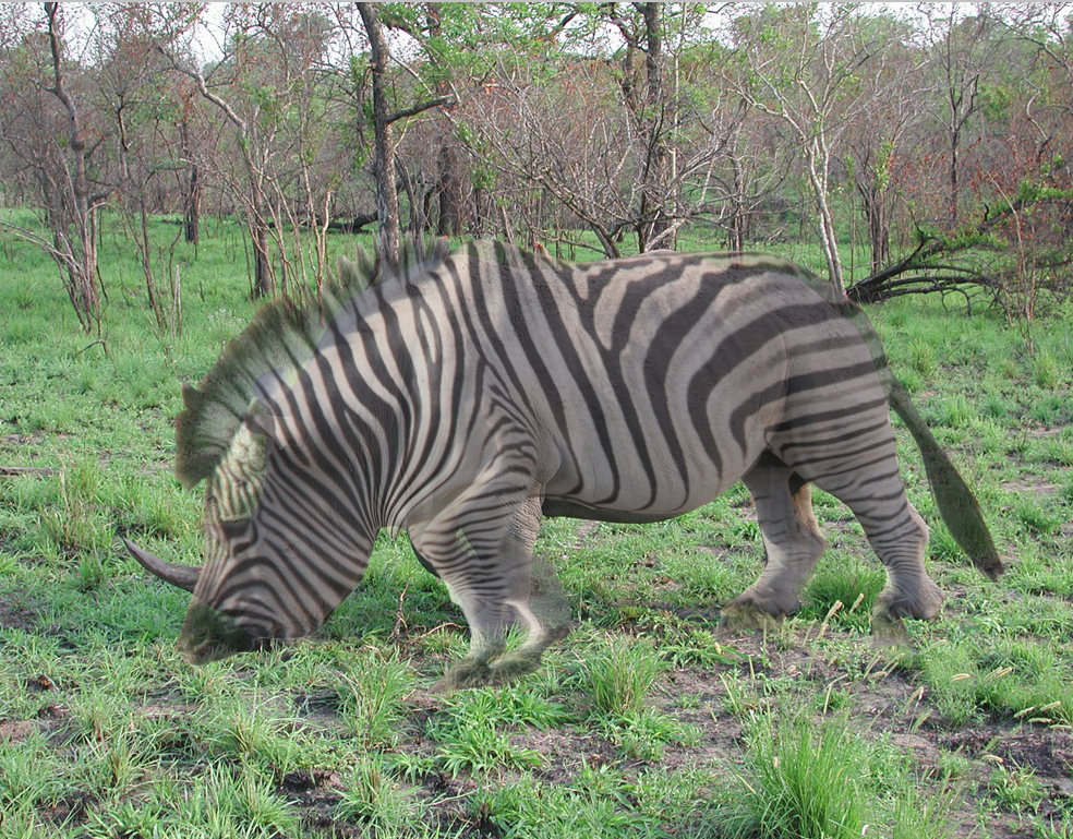
Zebrhino
Friday, February 7, 2014


Subscribe to:
Comments (Atom)